Krita
Krita 资源
- 官网 https://krita.org/
- 手册(英文 wiki) https://userbase.kde.org/Krita/Manual
- 英文PDF教程(2.8版) http://www-ftp.lip6.fr/pub/X11/kde-applicationdata/krita/marketing/2.8/aboutkrita2.8_sm.pdf
- 官方教程(英文) https://krita.org/learn/tutorials/
Krita 数字绘画入门
这是翻译自《Getting started with Krita》教程,这个教程的特点是:并没有介绍太多软件的工具使用方法或技巧,而重点是能从中了解到国外数字绘画高手的“工作流程”,对于初学者很有启发作用。注意新版本 Krita 的某些操作也许有所不同。
作者简介:(摘自 http://www.davidrevoy.com/static6/about-me )
我的名字是 David Revoy(网名 Deevad),我是一个法国艺术家,住在法国南部。我作为一个自由职业者有快要超过15年的工作经验。我的技能和专业知识包括 illustration(插图)、art-direction(艺术指导)、concept-art(概念艺术)和 teaching(教学)。
简而言之,我是一个 2D 平面艺术家(素描、彩绘、数字绘画)。我为书籍、海报、棋盘游戏、视频游戏、电影等创作从草图到特别定制的艺术工作,我的客户遍布世界各地。
我的一个特点是自2009年以来在Linux上使用100%免费和开源的软件来绘画。这一技术方向的选择与我的客户在兼容性上不会有任何影响:我仍继续实施这个行业标准,并且我可以打开或使用任何常规的文件。
时至今日,我暂停我的自由撰稿事业,因为需要在 Pepper&Carrot 全职工作。这是我创建于2014年4月的一个免费和开源网络漫画网站( http://www.davidrevoy.com )。你可以支持 Pepper&Carrot Patreon。
第一章 黑白肖像:设置和建模
原文: http://www.davidrevoy.com/article185/tutorial-getting-started-with-krita-1-3-bw-portrait
2013年8月28日
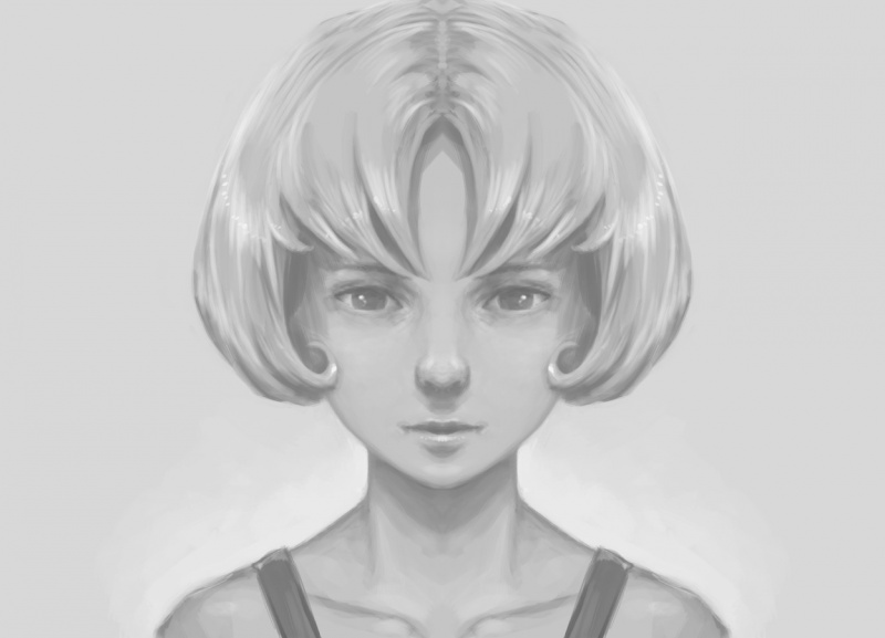
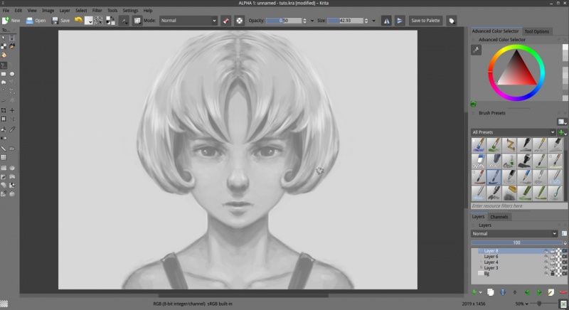
本节教程练习的结果
"Krita 数字绘画入门"是一个由三个章节组成的系列教程。本教程使用的是2013年发布的 Krita 2.7 版 + 我的笔刷套装 my brushkit V3 第三版。这套笔刷已经被添加到 Krita 2.8 版的默认笔刷中了。如果您使用的是更新的版本(例如 2.9.7 版),您就已经拥有了本教程用到的所有一切工具。本教程在2015年9月进行了部分更新。教程中的屏幕截图也许会与您的新版本 Krita 界面有所不同,希望这对您影响不大。
希望您能通过学习这个系列教程而有所收获。本教程的目的是,分享我对数字绘画的激情,以及帮助新人从必要的技术方面更快地上手:描绘一个故事、分享美妙的画作、表达一种艺术的灵魂,等等……
我的第一个教程将是简单明了但很有益的。“简单明了”,因为本教程是教您如何一步接一步描绘所有细节而完成一个对称画作的过程,但不涉及其中复杂的理论解释。“有益”,因为您如果跟着一步步操作,我们将很快得到一个绘画成品。这很值得您花一个下午的时间来学习 Krita 的基础操作,并且能收获到快乐。
现在,开始画画吧!
注意 1:操作过程别忘了经常保存您的文档,建议保存为“Krita 文档”(kra)文件格式。 注意 2:在本教程中,点击示例图可以看到大图。
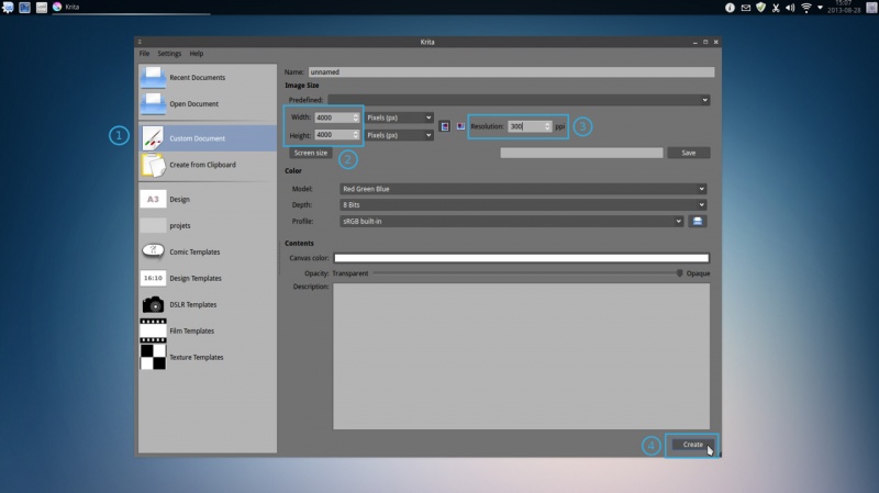
1、第一次启动 Krita 后,在 File(文件)菜单的顶部,点击 New(新建),会弹出一个对话窗口,在左边的标签栏中选择 Custom Document(定制文档)(1),并且创建一个宽度和高度都是 4000 像素(2)的新画布,设置分辨率为 300 ppi(3),如下图所示。名称或图像描述等这些地方可以跳过,最后点击 Create(创建)(4)。
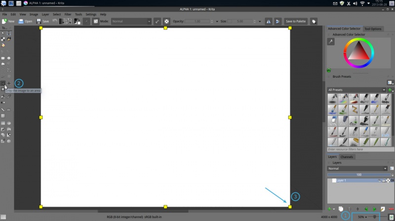
2、最大化 Krita 窗口。放大您的空画布为 50% 视图比例(1)(使用键盘上的 +(加号)按键,或者鼠标滚轮也可以缩放视图)。选择 crop 裁剪工具(2),在您的屏幕上沿着周围的边框裁剪出所有可以看到的画布。【注:这是考虑到有些用户的电脑屏幕比较小,而本教程的例子希望新手能在窗口内看到整幅画面。】
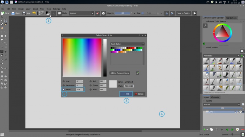
3、点击工具栏上小小的颜色方框(1)(点击的是下方的那个背景色)设置 value 亮度值为 216(2)(Hex: HTML: #D8D8D8 ),然后点击 OK 按钮确定。现在按下 Backspace(退格)键填充您的画布(4),这个灰色就将作为整个画作的背景色。【注:如果您设置的是前景色,可以使用工具栏的“油漆桶” Fill 填充工具,也可以使用菜单 Edit(编辑)=> Fill with Forgeground Color(以前景色填充),快捷键是 Shift BackSpace。】
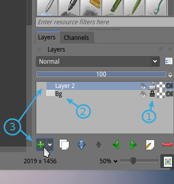
4、锁定您的图层(1)并且重命名图层(双击图层名称)为“Bg(背景)”(2)。在它的上面创建一个新的空图层 Paint Layer(绘图层)(3),就用默认的名称“Layer 2(图层二)”。
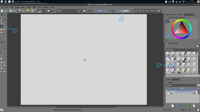
5、选择 Freehand 徒手涂鸦工具(1),默认的笔刷预设是 Bristles_hairy(猪鬃毛笔)(2)。【注:如果默认没有显示出笔刷预设停靠栏,可以在菜单栏上点击 Settings(设置)=> Dockers (停靠栏)=> Brush Presets(笔刷预设),或者点击顶部工具栏的 Choose brush preset (选择笔刷预设)也可以查找到需要的笔刷 。】在 advanced color selector(高级颜色选择器)停靠栏上,选择一个暗黑中灰的值(3)。在画布上按着 shift 键同时点按鼠标左键拖动,调整笔刷的尺寸为中等大小(4)。在顶部有个 Size(大小)滑块,可以看到数值是 40px 像素(鼠标左键点按可拖动数值变化,鼠标右键点击可手工输入数值)。
6、激活位于顶部工具栏的 horizontal mirror mode(水平镜像模式)按钮。
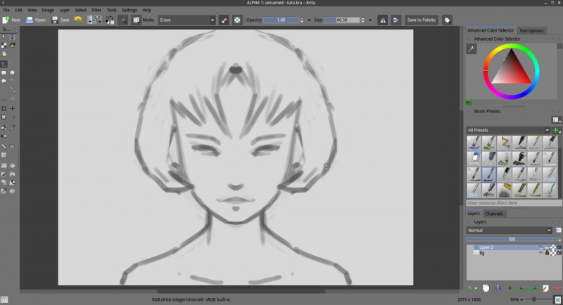
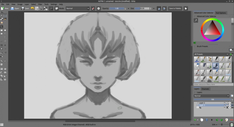
7、开始画布上大刀阔斧地画画,用直接和简单的线条勾画。勾勒出头部形状,用简单的线条画出眼睛、嘴巴、还有鼻子,耳朵也一样。按下键盘上的 E 键将会把您的笔刷切换为 eraser(橡皮擦),取代之前的画笔。再多按一次 E 键又将重新恢复为画笔的作用。您可以按您的喜好调整您勾画的线条比例。如果您觉得画得很不好,要删除所有全部的东西,按下键盘上的 Delete(删除)键即可。【注:在按下 Delete(删除)键之前,不需要 Select All 全选,就可以直接删除全部,Ctrl Z 可以撤销上一步操作。此外,顶部工具栏上也有 eraser mode(橡皮擦模式)按钮,关掉中文输入法才能按 E 快捷键。】
8、如果您平时不大熟悉素描或彩绘,现在可以在脸部画出大面积的阴影区,这个技巧有助于在您的脑海中形成一个大致的脸部 3D 模型,让您能估计出它的体积,并构想出一个抽象的光源及其偷下的阴影是什么效果。如果您开始画了,就试着画眉毛下的部分,以及鼻子下方、卷起的头发,还有脖子。再次提醒,使用橡皮擦来完善您的模型。保持画作简单直白:只有明亮区域和阴影区域。
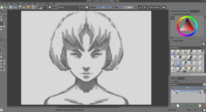
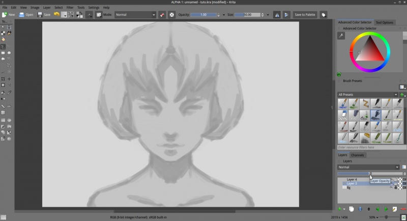
9、创建一个新的 Paint Layer(绘图层),把这个图层放在您的大面积阴影图层和背景图层之间。【注:鼠标点按图层拖动即可,或者选中图层,然后点击向上或向下箭头按钮移动图层。】选择默认名为 Fill_block(填充衬块)笔刷,然后使用较亮的灰色填充您所画的轮廓内区域(这颜色比您画的草图要深一些,然而又比您的画布背景色浅一些)。
10、选中您之前的阴影图层【注:即画有轮廓的图层 2】,按下快捷键 Ctrl E 合并下方的图层【注:也可以鼠标点击选中上方的图层,然后在右键菜单中选择 Merge with Layer Below(与下层合并),此外也可以在菜单栏的 Layer(图层)中也有相同的选项 】,调整这个图层的 Opacity (不透明度)为 50%。然后再创建一个新的 Paint Layer(绘图层)。
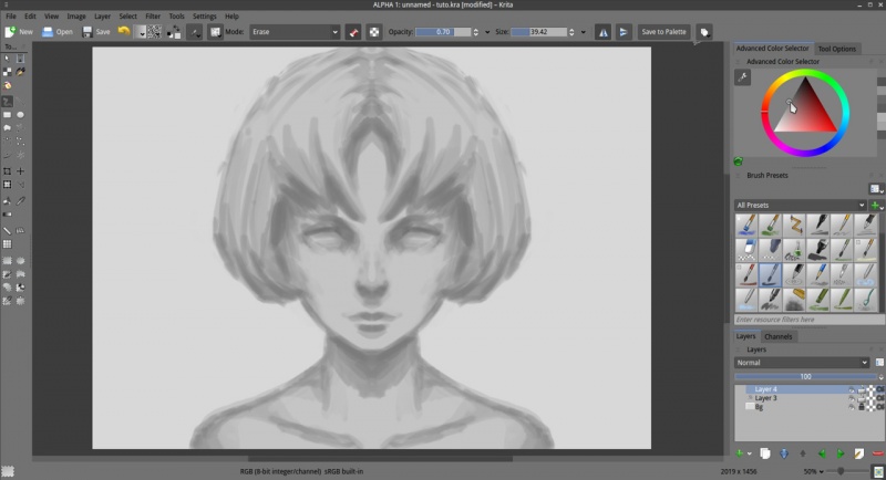
11、再次选择 Bristles_hairy(猪鬃毛笔)笔刷。在 advanced color selector(高级颜色选择器)里选择一个中灰色,像给瓷器上釉那样,使用有次序的线条描绘出更多的阴影。尝试是微妙的,玩你的手写笔的压力并在必要时擦除。试着稍稍精细化一些,必要时,使用您数位板画笔的压感以及橡皮擦功能。
12、创建一个新的 Paint Layer(绘图层),把您的灰色加深一点点,达到与您的背景色相同的灰度(或者按着 Ctrl 键点击画布可以拾取这个颜色)。【注:左边的工具栏也有”吸管“图标的 Color Selector Tool 颜色选择器工具。】继续在模型上绘画,您就当成是在雕刻一个三维的石膏像。
13、与下方的图层合并,方法是使用菜单栏的 Layer(图层)=> Merge with Layer Below(与下层合并)(或者用快捷键 Ctrl E)。创建一个新的 Paint Layer(绘图层),在我们的画卷上方,画出面部特征(眼睛/嘴巴/鼻子)。依然是仅使用预设笔刷在画布上描绘,只是需要把您的笔刷不透明度减小到 0.70【注:旧版 Krita 的笔刷 Opacity (不透明度)位于 (Size 尺寸大小)的左边,而新版 Krita 的笔刷 Opacity ,(不透明度)则是整合在 (Size 尺寸大小)右边向下小箭头的菜单里,菜单中还多了一项 Flow(流向)。】在画布上按着 Ctrl 键鼠标点击即可拾取颜色值。尽您所能,画出硬朗的边线,让一层层的轮廓逐渐清晰起来,让某些形状部位更凸显其外貌细节。这部分的工作主要是修复和处理。慢慢来,尽可能使用较大尺寸的笔刷,仅在需要的时候减小笔刷尺寸。
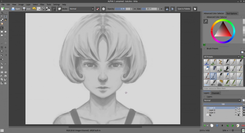
14、创建一个新的 Paint Layer(绘图层),选择 White(白色)以及相同的笔刷,但现在要用 0.50 的笔刷不透明度,用来描绘脸部以及头发比较有光泽的部分:或者是比较光滑、或者比较油腻的部分(或者是您想像中的光照环境中,被自然照到更多光线的部分)。这也是个精细活。
15. Create a new paint layer. Add some definition and details with a hard thin brush as the default brush preset 'Layout_Oval' and start to bring harder details to your drawing. Especially for glossy point or materials. You can add glossy reflective points of light with very bright values, almost or white. Shadows can be also creased a bit ; but I advice you to keep in a restricted range of values and avoid usage of darker tones. Also add some low opacity white around the silhouette to boost the contrast a bit.
At the end , the young fictive person I drew from imagination look a bit mystic in her attitude and simplistic in the design. I'll not add more accessories or design to gears on her to keep the tutorial method clean , but feel free to keep painting and follow your imagination... I advice you to keep doodling with a standard viewport , 50% and without zooming ; and train your painting skill within a "compressed value space" ( from white to grey ). It's easier than to manage a limited range of grey than dealing with full blacks to white to get started.
This first part of this tutorial end here. Next part we will colorize it ! Go to the next part now
Repeat it again till you'll feel more confident with the steps to replicate without this page. Create monsters, girls, men or robot head this way with focusing on giving the illusion of volumes and the modeling/shading. The fun is really here : creation. Feel free to have a watch to my other mirrored portrait black and white speedpaintings .
A question ?
Want to share the link of your results ?
discuss ? use the comments, I'll be around and participate too  :-)
第二章 上色:图层堆栈与混合模式
原文: http://www.davidrevoy.com/article186/tutorial-getting-started-with-krita-2-3-colorize
04 september 2013
The result of this blog post tutorial exercise over the first part, click to enlarge
"Getting started with Krita" is a tutorial series of three blog post and this one is the second. The tutorials were designed for Krita 2.7 in 2013 + my brushkit V3 . This brush were added in Krita's default brushes after Krita 2.8. Using a newer version of Krita ( eg. 2.9.7 ) you should have everything you need. I updated a bit the tutorial in september 2015. The screenshot are old and won't match your interface, but it's the best I can do at the moment to refresh this three post. My goal here is to share the passion I have for digital painting and help new talents to get faster rid of the technical aspect to do the essential : telling stories, sharing beautifull pictures, expressing an artistic soul, etc...
My second tutorial cover the steps necessary to bring a black and white artwork to the world of colors.
Contents :
Part 1. : black and white : setup and modeling
Part 2. : colorize : layer stack of blending mode ( you are here )
Part 3. : finalising : render, post effect
Let's paint !
Note : I let you the care to save your document often during the process as on the part 1 . I advice the 'Krita document' ( *.kra ) files , but this time , why not using a different saving option? a feature in the menu "File > Save incremental version" is useful to keep track of your 'work in progress' steps. Press it, and check on your disk what this feature does.
Note 2: As usual, click on the pictures to enlarge them.
1. Open your artwork done on the first part. Set your zoom to 50% and center the artwork into your viewport. Don't forget to activate the mirror mode in the top toolbar.
2. Flatten all your layers Ctrl+Shift+E or in menu Layer > Flatten Image , name the result 'b&w' . Duplicate your 'b&w' layer, name it 'colorbase' and call the Hue/Saturation/Windows color filter by pressing Ctrl+U. Check the 'Colorize' box.
3. With the Hue and Saturation slider, search the main tone of your picture ( don't use the Lightness slider, keep it at 0 ) . Here I want a desaturated blue hue. Then press ok
4. Create a new 'paint layer' above, named 'color' with the blending mode HSY > Color . Take the 'Airbrush_pressure' brush preset. Do a first pass of tinting area of your artwork with pure colors and test around. Fun , right ? on a 'HSY color' blending mode layer, all the stroke affect only the Hue and saturation , not the value. So you can keep your value and paint color without destroying them.
5. Keep painting. Note : the color picker ( hold Control key plus click ) works fine on a Color type of layer , you can use it. Adjust when necessary by removing the color with 'E' the 'eraser mode' to reveal the base color underneath or enrich the range of colors in your artwork by using hue from the Advanced Color Selector. I often restrict myself to unsaturated tones because it's easier to saturate or enrich later. You can see on the screenshot my 'layer preview' ( a dialog who appear on the bottom right, it will appear also for you if you keep stylus over the layer name ). This preview will give you an idea of the painting work I do on it.
6. Create a new paint layer named 'glaze' and with the blending mode Arithmetic > 'multiply'. We will do now an almost similar pass than a traditional glazing with oil painting . Take again the "Airbrush_pressure" brush preset with mid opacity and glaze the colors, add red in the shade of the skin to flesh the model , make deeper the zone where the skin doesn't reflect light , and let see more the blood color under the skin. Crease also some deeper shade for the hair. Glaze the eyes as if you would perform a make-up on them. Resize your brush if necessary to perform more little details. I don't advice to zoom in. Glaze also the lips as if you were applying lipstick on them. Remember glazing will darken only the colors and so it's important to keep doing it steps by steps, low opacity strokes by low opacity strokes. Glaze the overall artwork till you reach a good aspect ; this include hairs, backgrounds, etc... ( Note : Glazing steps is good to add stain, tatoo, patterns but to keep this tutorial clean and generic, I'll keep my basic character ).
7. Create a new paint layer named 'vivid' and use the blending mode Mix > 'overlay' on it. With a dark airbrush at low opacity , vivid the shadows. It should increase the contrast in those areas, unify the local tones and add saturation. Do the same with a bright color to brighten zone and so, increase the intensity of the lighting. With white , do little and subtle corona of light around your higher values ; such as reflection on the lips, and on the eyes.
8. Create a new paint layer named 'texture' and use the blending mode Mix > 'overlay' on it also. With a dark grey and a variety of preset who do textures on the canvas as the 'Splat_texture2' or 'Sponge_texture' in the default brushes, we will add a soft texture to part of our artwork. For example, a bit of grain to the skin. Be subtle , the effect should not 'jump' into the eyes, but be a secondary thin effect. If your effect is too strong , erase it.
The colorization setting for our artworks is now done. The goal was to 'sketch' the colors of our artwork. Also, I kept the color choice simple on my example even if it's a bit boring and generic. But i think a tutorial example has to be generic to be enough open to any interpretation. The important is now about what you can do with it. Feel free to test make-up ; tatoo , blue skin , reptilian skin , colored hair , etc... etc.... more material , more lighting situation.
A bit more about the 3 pass, 'color' / 'multiply' / 'overlay' : There is an endless way to digitally colorize a black and white artwork. Here is just a 'cooking' proposition on how those three pass of layer blending mode 'color' / 'multiply' / 'overlay' can work together. They work better if you kept your black and white value bright as we did on the previous tutorial. If you practice them, they become predictable. I hope this visit inside the interface of the powerful options of Krita made you discover new aspect of this software. Options you probably ignored before. Repeat it again till you'll feel more confident with the steps to replicate without this page and express your color tastes with this tool and method.
Next part ( to be published ) we will learn the way to push the rendering to a higher definition and correct bugs. Our picture has many issue now , and don't offer many details. By the way, those issues and bugs can have a charm. A 'speed-painting' charm.
A question ?
Want to share the link of your results ?
discuss ? use the comments, I'll be around  :-)
第三章 细节和最终定稿:渲染及后期效果
原文: http://www.davidrevoy.com/article187/tutorial-getting-started-with-krita-3-3-details-and-final-touch
05 september 2013
The result of this blog post tutorial exercise over the first part & second part, click to enlarge
"Getting started with Krita" is a tutorial series of three blog post and this one is the third. The tutorials were designed for Krita 2.7 in 2013 + my brushkit V3 . This brush were added in Krita's default brushes after Krita 2.8. Using a newer version of Krita ( eg. 2.9.7 ) you should have everything you need. I updated a bit the tutorial in september 2015. I hope you'll learn something with this series. My goal here is to share the passion I have for digital painting and help new talents to get faster rid of the technical aspect to do the essential : telling stories, sharing beautifull pictures, expressing an artistic soul, etc...
My third and last tutorial of this series cover the last steps necessary to bring the artwork to a 'final'. We'll increase 'a bit' the details.
Part 1. : black and white : setup and modeling Part 2. : colorize : layer stack of blending mode Part 3. : finalising : details, and final touch ( you are here )
Let's paint !
Info : I let you the care to save your document often during the process as on the part 1 and 2. By the way, do you know you can save your picture to the Open raster format (*.ora ) too and keep your layers and blending modes ? Open raster is slower to save, but offer a good advantage over the Krita document *.kra : you can open *.ora with Gimp or Mypaint ; if you need to edit your picture later in one of this software.
1. Open your artwork done on the second part. Set your zoom to 50% and center the artwork into your viewport. Don't forget to activate the mirror mode in the top toolbar as usual.
2. Flatten all your layers ( Ctrl+Shift+E ) , name the result 'base' . Then duplicate the layer above and name it 'paint'.
3. We want now to upscale our artwork to the double ( 200% ), to increase the resolution and get more room to add details. Go to the menu Image > Scale to new size (1) . Change the method for width to Percent (2) insert 200% . The lower number 'Height' should follow proportionally. For the interpolation , choose 'Lanczos3' , then press Ok . Let Krita compute...
4. The artwork should now appears much more bigger than it was before in the viewport, especially at 50% zoom of the viewport. It should be exactly the double. Keep painting at 50% viewport ; our brushes preset are sort-of optimized for this zoom. The artwork will now use more disk space and resource, but we will use smaller brushes so we wont notice a very big lag. We need this resolution to increase the details and be able to publish it. The minimal resolution to print an artwork is 300ppi. If you zoom out to 33% on a regular 96ppi screen, you should have an idea of the 'real' size of the artwork. If you want to pan your canvas ; hold Spacebar and drag with mouse.
5. Now a little part outdated, coming from 2013. We don't do it this way in 2015. So don't pay attention too much to this screenshot under, this dialog don't exist anymore.
In this step, we will add our favorite brushes to the 'stylus/mouse right-click' palette. Yes, the little palette ring poping-up over the canvas as in 'step 6 (2)' screenshot. The new 2015 way to add brushes to this 'Palette' is much more simplier : in your brush preset docker, right click on the brush you like , and assign them to the tag group 'Favorite Presets'. Done.
6. Ok, our right-click on the canvas "Palette" (2) is setup now, we fed it with 'Favorite Presets' we like. Press Tab to hide all the docker around, and enjoy a larger view port. Press tab again at any moment to exit this mode. Other tool can be found on canvas. The history color pop-up with 'H' key (3) show a color history palette. The color selector with Shift+i (4) can offer more comfort ( because more room, size is bigger than in the right-click palette ) to switch color.
7. If you are not comfortable with using Shift+i ( I'll understand ) go to Settings > Configure shortcut (1) and in the search field enter the keyword 'show' (2) then in 'show color selector' enter the custom shortcut 'C' ( reasign if necessary ) , press OK to accept (4).
8. Now, you can start a long painting session with all this tools, fullscreen. Here I'll spend around 4 hours on detailing. Paint to sharpen the edges, smooth the surfaces and bring a whole new level of details and ease for your (future potential) spectator to understand volumes and the materials. Use the 'Bristles_hairy' brush with blending mode 'normal' / 'addition' / 'glazing' if you want to darken or brighten the detail. You can paint directly on your 'paint' layer. It's a long step , reviewing zone by zone to adjust or correct and to increase the details. As most of the colors are around , use only the Ctrl+Click color pick on canvas to pick your needed color. Zoom out from time to time to see the overall and turn off and on the visibility of your details layer, to see if you are not destroying the zone instead of making it looking better. In case of accident, you can still remove the details with a soft eraser. That's why I keep two layers, because working on a zone doesn't always result as an improvement, and I have to keep a security to go back at a earlier step. The detailing step is the longest of all the process ; but one of the most relaxing :-)
9. While detailing, I changed the eyes expression a bit ; to test, but I didn't liked it, I also found the whole shading of the face a bit flat, and decided to continue to work on shading it zone by zone, and rework the volumes. I also tested glossy hairs, then erased half the effect to make it more subtle, because it was definitely too artificial. Details is really a part of test and corrections, to improve the artwork. You can even dive to zoom 100% to solve little light as a reflect in the eyes. Here I use 'Airbrush_pressure" with low size to add subtle lines. Also, keep constantly an eye on the overall by zooming out.
10. When you'll start to really have some credibility into your lighting and volumes, you may start to feel a certain discomfort in front of the piece. That's because of a too symmetric drawing. It's too artificial. Time to start to break it ...
11. To break symmetry , easy enough , just unactivated the mirror icons and fix the eyes with brush manually ; for making the two eyeballs react to the same reflection of a light source ( you see it? the white in the eyes are now not symmetrical and react to a source of light coming from left of the model ) and paint subtle change here and there. Then also sign your artwork. You can now save your final result in a lossless flat format such as *.png and flatten the picture if you want.
Note: [Jpeg/internet export] If you want to share your result on internet ; I advice going first into File > Create copy from your current image , then scale down your image with Image > Scale to new size and turn the width to a much lower resolution ; for example 720px large. Press ok and save it as JPG with a quality a bit above 90%. Then why not share your image to the world? Ok, probably not this time if it's your first try :-) Maybe soon on the Krita forum art gallery ? http://forum.kde.org/viewforum.php?f=276
This third and last part of this tutorial end here...
click to enlarge
All along those 3 past weeks and tutorials I shared with you a path and some of my 'cooking receipt' to make picture. Feel free to experiment around and develop your own ; -there is endless way to make a picture- . I hope this tutorial was a good way to "get started" and make you discover some of the feature of Krita you needed to start to draw and paint with comfort. Keep painting !
Stay tuned for the next series !
